SnapLogic Visual Identity Refresh
I was tasked with giving the SnapLogic visual expression a makeover. I worked closely with the CMO and other internal partners to make sure the new direction aligned with company values and the product offering. The top reasons for this refresh included being able to stay current with marketing trends, reposition the company in the marketplace, and keep up with competitors in the space.
Responsibilities: creative direction, execution, project management, production, and internal and external roll-out.
Assets include collateral templates, business cards, website refresh, PowerPoint templates, internal and external swag, badges, product diagrams and icon library, etc.
Designed the glyph (OG) to be used as an element across collateral
Updated the logo into the solid classic blue
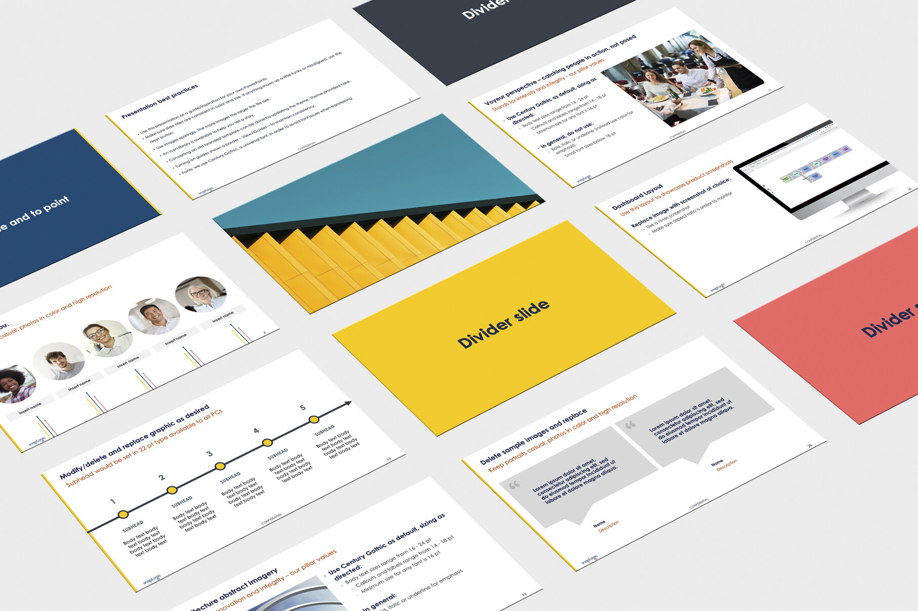
Created a diverse PowerPoint template
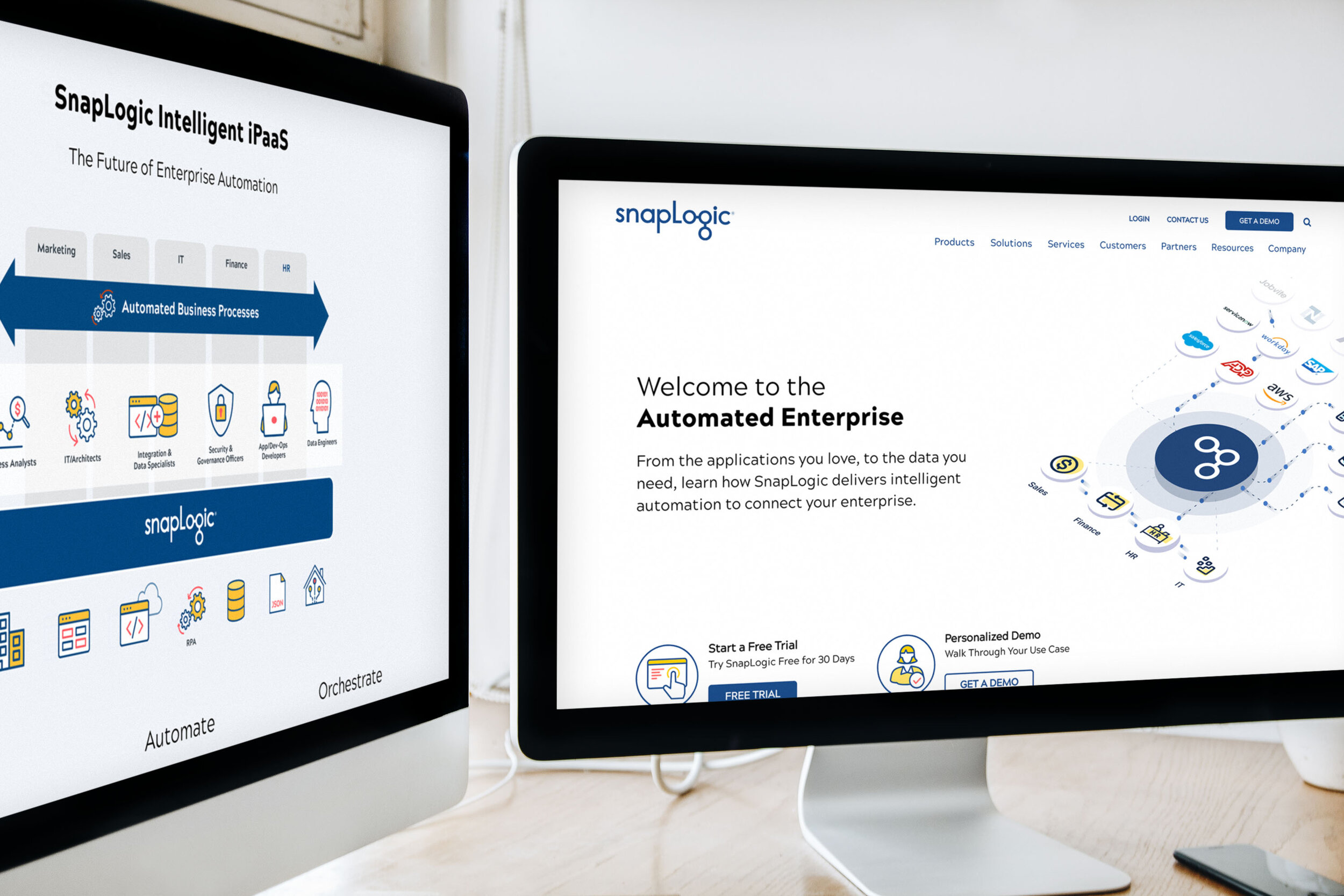
Brand refresh extended to the website and all supporting assets
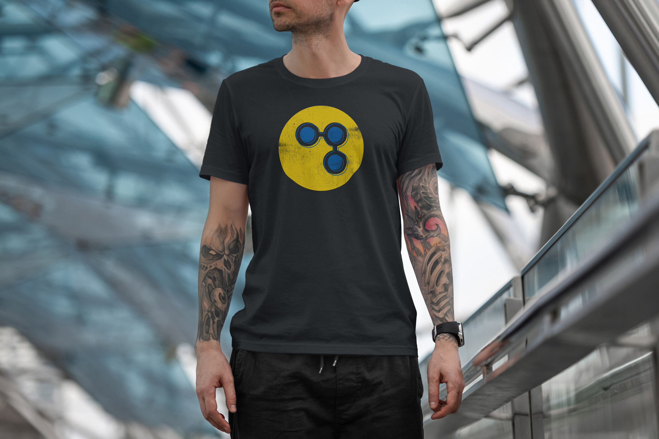
Created some "fun" t-shirt designs to create brand awareness
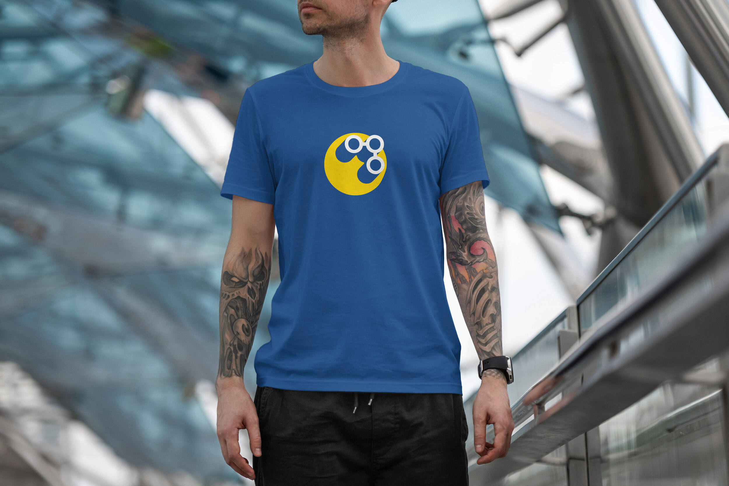
The OG signal t-shirt design on the classic blue
New color palette lends itself well to color code and make assets pop
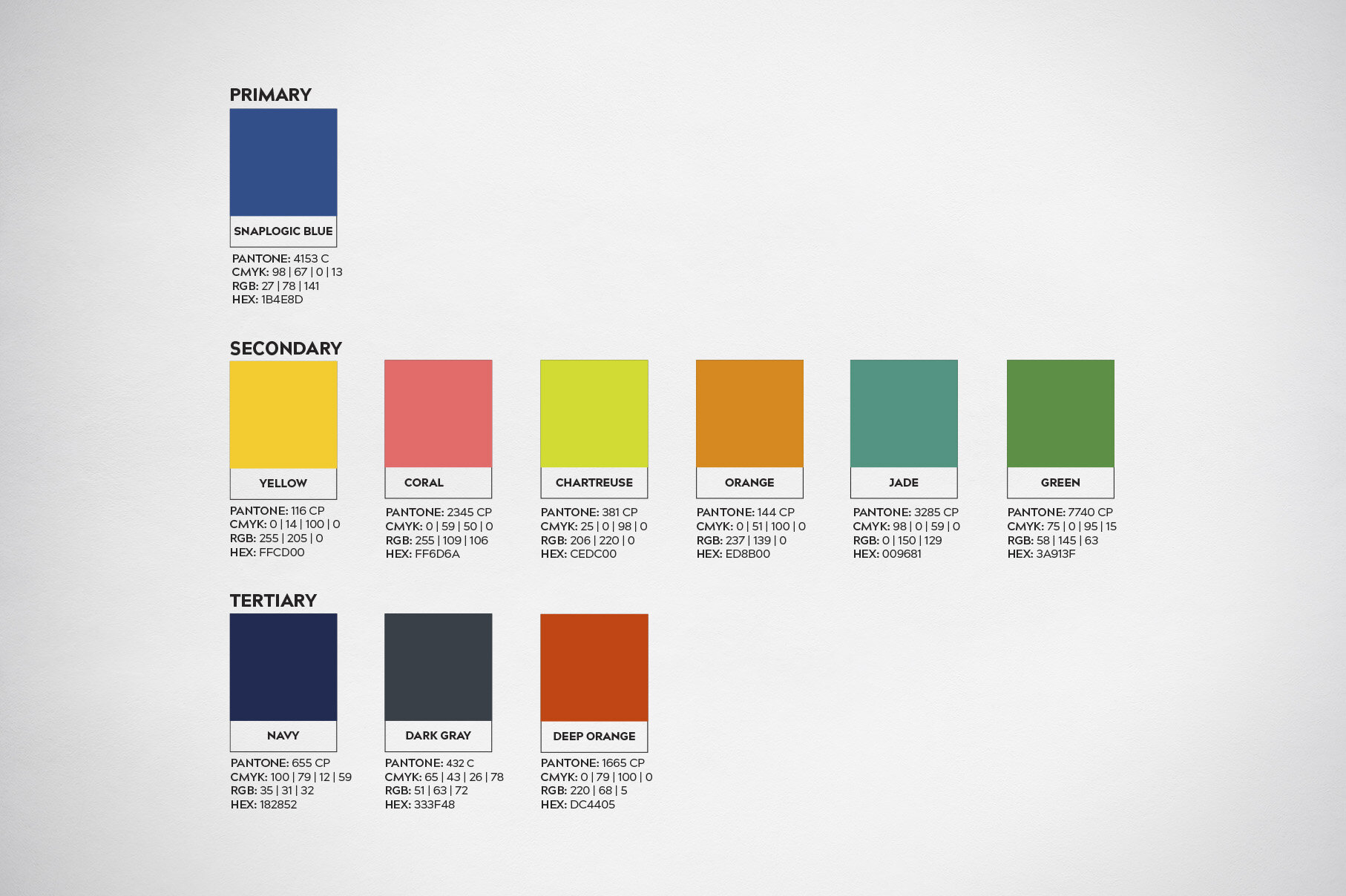
Color palette
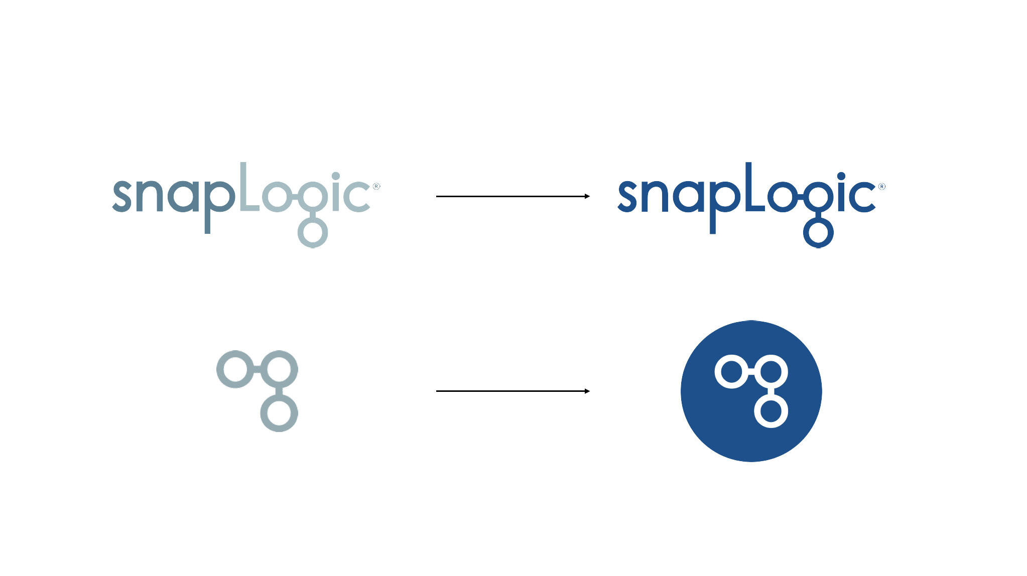
Before and after
More brand work.
Below is a collection of other brand work done through the years.